Website Strategies – Smart Home Page Design
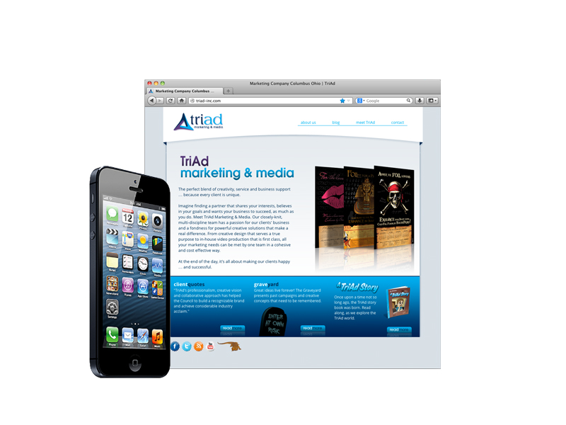
We’re often asked about adding more “call-out” boxes on the home page with hyperlinks to inside pages. “You know, like all the icons displayed on my smart phone! One click gets you anywhere!” Yes, a home page can be set up that way. But it’s usually not a great idea. Here’s why.
1) Your website isn’t a mobile phone. It is a different experience entirely. We use our phones for communicating instantly and gathering information on the run – making a quick call, scanning e-mail, sending a text, sharing on Facebook, composing a Tweet or sharing an Instagram. In comparison, we visit websites to learn about a company and its wares. Yes, we are most often in a hurry. But we still dig in for a few minutes to read articles, compare products and perhaps make a purchase. We look for engagement. We try to get a feel for the brand.
2) Consider the usability factor. We control the layout of our smart phone icons and use them every day. We know where everything is, so our phone becomes a very handy tool. But as a website visitor, we have to scan every unfamiliar icon or call-out box, so having a dozen or more choices actually makes it harder to find what we want. Icons have no hierarchy. They rely on user familiarity to work.
3) That wonderful navigation bar running across the top of most web pages provides the ideal reference point. It is familiar turf and people are accustomed to using it. Every section of the site – if not every page – is revealed in an organized display with a simple move of the mouse. Pick your destination, click once, and you’re there. It works. Why muddy up your home page with an over abundance of call-out boxes that may actually detract from the visitor’s experience?
4) Most visitors skip the home page. If your website is optimized properly – and it should be – people searching for a specific product or service will bypass “Home” completely, landing deep inside the site on the appropriate page. Try Googling “iPhone 5c” or “Chevy Equinox” or “Fifth Third mortgage loans”. Immediate engagement!
So I believe that ganging up call-out boxes on your home page is an exercise in faulty logic. At the extreme, you present a first impression that is visually unappealing and your home page becomes little more than a hyperlink farm. Surely your visitors deserve a better experience. Your home page is a delightful front porch or an attractive foyer that draws visitors into your home. Introduce yourself, capture their interest, and use a few call-outs to highlight the really important stuff – a new product, a spectacular promotion or a special event. And remember, we greet people at the front door but we visit with them inside our home!
Drop Us a Line
It’s time to find some inspiring ideas for you!
Give us a call at (800) 288-7423 or fill out the form below
"*" indicates required fields


